
 We need a revolution in software interaction design. Apple and Google will not provide it. They are too big. They are not the solution. They are the problem.

This revolution will probably come from some unsuspecting source, like the Maker Movement, or an independent group of people or company that is manufacturing physical goods. Here’s why: as computers increasingly inhabit physical objects, as the “internet of things” grows, as more and more computing makes its way into cars, clothing, and houses, there will come new modalities of interacting with software. And it will be dictated by properties of the physical things themselves. Not by the whims and follies of interface designers, whose entire universe consists of a rectangle of pixels and the touch of a user.
Let me explain what I mean when I say that software interaction design needs a major paradigm shift.
 I hate having to use the word “affordance”. It’s not a very attractive or colorful word. But it’s the best I’ve got. If you’ve read my other blogs posts or my book, Virtual Body Language, you have heard me use it before. The word was given higher currency in the user interface design world thanks to Donald Norman, whose book, The Design of EveryDay Things, I highly recommend. (He was forced to change the name from the “Psychology of Everyday things”. I like his original title better).
 Affordance, originally used in J.J. Gibson’s theory of ecological psychology, refers to the possible ways an animal or human can interact with an object (which can be another animal). We often use it in reference to the ways that one interprets visual, tactile and sonic features of a thing, be it an egg-beater, a frightened dog, or a new version of iMovie.
 A “natural affordance” is a property that elicits an understanding or response that does not have to be learned – it’s instinctual. In reference to industrial design: a knob affords twisting, and perhaps pushing, while a cord affords pulling. The term has more recently been used in relation to UI design to indicate the easy discoverability of possible actions.
UPDATE…
Bruce Tognazzini pointed out to me that Donald Norman has more recently been using the term “Perceived Signifier”. And this article explains some of the new semantic parsing going on regarding the word “affordance”. Personally, I would be happy if all of this got subsumed into the language of semiotics.
I believe we have WAY TOO MANY artificial affordances in our software interfaces. I will repeat the call of many wise and learned designers: we need to build tools with natural affordances in mind. Easier said than done, I realize. Consider a common modern interface, such as the typical drop-down dialog of the Apple that allows one to download a file:
 As a general rule, I like to download files to my desktop instead of specifying the location using this dialog. Once a file is there, I then move it to the appropriate place. Even though it takes me a bit longer, I like the feeling of putting it there myself. My muscles and my brain prefer this.
Question: have you ever downloaded a file to a specific, somewhat obscure folder, and then later download another file, thinking it was to your desktop, and then not being able to find it? Well, you probably didn’t think to check the dialog box settings. You just hit SAVE, like you usually do, right? It’s automatic. You probably forgot that you had previously set the dialog box to that obscure, hard-to-remember folder, right? Files can get lost easily, right? Here’s the reason:
Software files are abstract concepts. They have no physical location, no mass, no weight. All the properties that we associate with files are virtual. The computer interface is just a bundle of physical metaphors (primarily desktop metaphors) that provide us with affordances so we can think about them as if they were actual things with properties.
The dialog I showed you doesn’t visually express “in” in a natural way. The sensation of the action is not like putting a flower in a vase or drawing a dot in a circle.
Herein lies a fundamental problem of software interface and interaction design. Everything is entirely arbitrary. Natural laws do not apply.
Does the natural world present the same kind of problem as we have when we lose files? Sometimes, but not so often. That’s because the natural world is full of affordances. Our memories are decorated with sensations, associations, and connections, related to our actions. If I physically put a rubber band in an obscure bowl on the top shelf, I have reason to remember this action. Muscle-memory plays a major part in this. With downloading files on a computer, you may not know where you put the file. In fact, sometimes you can’t know!
In fact, it’s not fair to use the word “put”, since “putting” is a deliberate, conscious act. An accidental fumble on the keyboard can cause a keyboard shortcut command that deletes a file or opens up a new window. When this happens, the illusion breaks down completely: this is not a real desktop.
Am I getting too esoteric? Okay, I’ll get more down-to-earth and gritty…
My Deteriorating Relationship with Apple
 My recent experiences with Apple software interfaces have left me worse than disenchanted. I am angry. Apple has changed the interface and interaction of one too many of its products, causing my productivity in some applications (like iMovie) to come to a screeching halt.
At the end of the day, I’d rather keep my old computer with my trusty collection of tools than to have a shiny new, sexy, super-thin Macbook that replaces my trusty old tools. There are years of muscle memory that I have built up in learning and using these tools. My career depends on this muscle memory. When Apple changes these interactions with no clear reason, I become very angry. And so should all its customers.
And then…there is iTunes.
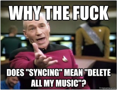
Let’s not talk about iTunes.
Apple’s latest operating system disabled many of the interactions that I (and many others) have been using for decades.
And from the same thread… “If a company cares about users, it doesn’t make a change just for the sake of change that wipes out thirty years of muscle memory.”
Am I saying that a company like Apple should never change its interfaces? Of course not. But when they do, they should do it carefully, for valid reasons, and gracefully. And they should ALWAYS give their customers the choice of if, when and how to adapt to these changes. Easier said than done, I know. Apple is like most other companies. They feel they have to constantly make NEW products. And that’s because our capitalist system emphasizes growth over sustainability.
Will the Maker Revolution Cure Us of Arbitrary, Ephemeral Design?
This is why I believe we need to return to natural affordances that are as intuitive as putting a spoon in a bowl or carving the bark off a stick. The more natural the affordance, the less arbitrary the design. Designers will have to be less cocky, more reverent to human nature and physical nature.
When real physical things start dictating how we interact with software, the playing field will be different. And software interaction designers will have to fully understand natural affordances, and design for them. That’s a revolution I can get behind.
.

Hip hup! Agreed. I’m grumbling more and more often as I’m forced to use the increasing number of annoying and confusing skeuomorphisms in interfaces, especially on account of Apple.
I had to learn to hack iCal’s internals to bring back regular silver buttons when all of a sudden my trusty computer calendar was replaced with an obnoxious faux-leather feel. (Not something I enjoyed as a vegetarian. How about FUR instead?) Then I gave up on iCal entirely when they made it impossible to turn off “page flipping” animations moving from month to month, which did nothing but slow the interface down so much that I was reluctant to ever look at something from a year ago. Twelve page flips, about 1 second each.
Most recently, I’m infuriated to see checkboxes replaced with left-right “switches” meant to imitate physical toggles. They take up more space, and their “on” state is never quite apparent. (Does “off” mean “Currently off” or does “off” mean “click here if you want it off?”
What was wrong with checkboxes?
With Apple software, even today, the visual always indicates the current state — same as it always has with checkboxes. That’s one way they’re consistent.
Windows/Facebook/Android software sometimes uses the opposite convention with some controls, for some reason, and third-party software on all platforms is often inconsistent.
I have no problem with custom controls AS LONG AS they look nice, indicate the correct state, are activated the same way as the standard controls, obey the user’s visual preferences (like “increase contrast”), are scriptable, and are visible to accessibility tools. Most designers/developers don’t bother with all that, so they’d be better off using the built-in checkboxes.
Thank you Jeffery. A number of valuable insights here, especially your take on metaphoring the virtual world, and your reminder that we also metaphor the material world, all the time. Lionel
Apple needs a revolution in software QA. They can’t even get SSL right.
The question of course is, interaction design for whom and where?
I wouldn’t argue that new devices may require new metaphors and new ways of thinking about how to create delightful, useful interactions.
I would argue, however, that the PC is possibly too complex to reinvent at this point, unless whatever replaces it provides a great deal more utility, flexibility and automation.
Apple’s already split its OS UIs between desktop and mobile, and brought aspects of mobile / touch UI back to the desktop. Long-term, they may further merge as AI becomes more mainstream, but ask anyone who programs or creates content if they would give up control, and have to re-learn apps and workflows they’ve spent 20 years honing… you’ll get an earful.
Power users, who likely have better spatial memory of their own machines, prefer things that let them achieve their tasks with minimal effort; hence, column view, Quicksilver shortcuts, Spotlight search, and the command line. After any amount of time, file clutter happens, but search finds the needle in the haystack quite efficiently. I launch apps using Spotlight way more often than from the Dock.
Then again, I’ve been using computers since the 1980s, and someone born in the 2000s will have a different take, for sure.
What you’re really complaining about, it seems to me, is inconsistency, which I can get behind 100%, and the habit of designers to reinvent things just for the sake of it.
When it comes to GUI apps, Apple has a different language for Pro apps than its consumer apps, and it’s relatively consistent between Logic, FCP and Aperture.
iTunes.app, even with its recent makeover, seems to get in the way of actually finding, sequencing and playing media, and would probably benefit from being split up into multiple apps for TV, Movies and Music. And as you’ve said, it clunks out whenever you bring the device in contact with the computer.
That said, the iTunes backend ecosystem seems to work quite well for keeping purchases and files synced in the cloud, which is a great benefit. The problem of “losing” music is thus mitigated, because you can always redownload it – at least with iTunes Match, of course.
My brother suggested I may like this blog. He used to be entirely right.
This post actually made my day. You cann’t imagine simply how so much time I had spent for this information!
Thank you!
What I've been reading lately (week 12 of 2014), by Samuel Ericson
Hi Jeff, thanks for sharing these great insights. Concepts such as affordance and muscle memory are central points of IxD, mainly when we get started with the digital designing of the things. Time is right to put this discussion in foreground, but I still disagree with some of the things you said.
Big companies like Google and Apple are investing and researching on the next level of user experiences right now, and like nobody else. This means that if a minor player manages to rise in this scenario they will be probably bought. So from connected cars to flexible screens and smart watches, its undeniable that the big players will drive the next step. And when I say next step, I mean both the industry wide adoption of new standards and worldwide consumer market creation.
Lastly, I think your article is somewhat getting down to subjective issues between you and Apple. :) You are probably an old experienced user of personal computers, and as such, you have attached your muscle memory to some “arbitrary” conceptions of scrolling such as the scroll bar.
We can’t continue thinking it is affordable to swipe up your finger because you need a little piece of UI to go up the screen, so as to getting the upper portions of a scrollable interface. This is not natural, and Apple managed to discover it. People from the new world will not be using PCs in the same intensity they will be using touchable interfaces, and in this new world people are thinking that if they want to roll up some screen, they have to drag up the screen. And as Apple is adopting touch across all of its product line, from desktops (with magic mouse and trackpads) to mobile devices, it’s just nice to propose the new standard. You can aways switch it back, if you like.
I know Apple changes are usually OS wide, and many of their products sometimes changes too much, this is also the same reason their old flagship products are still new, alive, and selling. Apple “erros” are usually linked with a vision of consistency, and of how thinks should work in digital. They have a voice, Google has a voice, and I think these kind of companies are the next key game changers.
My bet.
Thank you Alvaro for a thoughtful and fair comment.
You are delving into the more subtle aspects of how large companies like Apple manage the affordance problem, improve their products, and do the best they can to stay consistent over time. This is certainly not a simple task, and it can never be perfect.
You initially disagreed with my point about real innovations coming from smaller companies instead of from Apple or Google. And your reasoning is that if a smaller company rises to the occasion and improves a design, they will get bought by Google or Apple.
I would not use this as an example of large companies being good at innovation. I would use this as an example of large companies being good at buying small companies. And I also disagree that all good innovative companies should get bought out my large companies. Too much of that is not good for the economy and it reduces competition.
Still, I do agree that these companies are doing a (mostly) good job at applying research on affordance and good design.
On your comment about the reverse scrolling issue. I actually did change to use the new Apple reversal scrolling direction what that was made. I assumed that they had made this change so that the touchpad on the laptop would be consistent with the new touch screens. Even though the change was disruptive, I understood the reasoning. I could see how this was a relatively small painful change to avoid large painful changes (or inconsistencies) in the future.
As you may have noticed in my post, the real frustration was with iMovie. As far as I can tell, there was no good reason to disable the old version other than the fact that Apple would have to support both the old and new versions. If Apple had done a better job with the design of the new iMovie, or if they had made the change more incremental, I would not have had all my very important video production projects come to a screeching halt.
Perhaps it won’t matter over time, because I’m 53 years old. Older users who are set in their ways will eventually die, while new users will start fresh with the paradigms. The evolutionary flow of human history must go on.
I felt it was reasonable to call foul on the iMovie change. At the moment, I have switched over to Adobe Premiere, and I have quickly become a convert.
I still always have a Macbook, iPad, and iPhone on me wherever I go.
Even though I love my country, I complain about my government at times, and I vote because I’m a citizen; citizens are active agents in a democracy. With corporations like Apple, I feel I also have good reason to complain, and to switch to an Adobe product when I feel the need, which in this case was both ideological and practical.
Thanks for the comment!
-Jeffrey
Por qué estudio lenguajes de programación - Remoquete
Disappearing UI Elements: Utter Stupidity – Nature...Brain...Language...Technology...Design