Anorexic Typeface Syndrome

As a design thinker of the Don Norman ilk, I place ample blame for human error on negligent or arrogant design from trend-setters who seem to be more intent on presenting slick, featureless interfaces than providing the natural affordances expected by human eyes, brains, and hands. Take typefaces for instance.

As the pixel resolution of our computer displays becomes higher, the arrogant designers who get hired by trend-setting corporations find it necessary to choose typefaces that are as thin as possible, because…thin is in!

Well, I have something to say about that: Anorexia Kills!

How about people’s ability to fucking read? I kind of like it when I can read. And I don’t like it when I am made to feel like an 87 year-old who needs a magnifying glass (like my mother – who is especially challenged when she has to actually read words on an iPad).

And it’s not just the rapidograph-like spiderweb of fonts that are becoming so hard to read. Designers are now fucking with contrast:

“There’s a widespread movement in design circles to reduce the contrast between text and background, making type harder to read. Apple is guilty. Google is, too. So is Twitter.”

—Kevin Marks WIRED: https://www.wired.com/2016/10/how-the-web-became-unreadable/

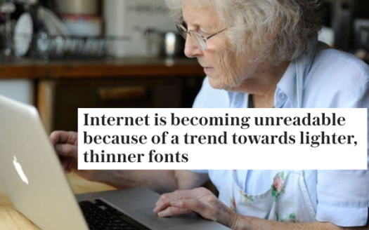
Sarah Knapton: https://www.telegraph.co.uk/science/2016/10/23/internet-is-becoming-unreadable-because-of-a-trend-towards-light/

I was in Boulder, looking for the Apple store so I could by a new MacBook Pro. I had a hard time finding the store because the symbol I was looking for was barely visible from a distance, or unless I was looking straight at it.

Apple is becoming less interested in helping us be productive than they are in being the most slick designed thing in the room – or the mall. Apple originally earned a reputation for good user-interface design. But the capitalist engine of unlimited growth and the subsequent need to differentiate among the competition has created a pathology. It has created a race to the bottom. At that bottom…our senses are being starved.

I have similar thoughts on the way physical Apple products have become so thin as to be almost dangerous – in this blog post.

It may be my imagination, but since buying my new MacBook, this very blog post seems harder to read. Did WordPress go on a font diet? Or is Apple the culprit? Check out this screenshot of this blog post as I am seeing it on my MacBook:

You may have heard the saying: “good design should be invisible”.

“Design should help people and be a silent ambassador to your business. Good designs are those that go unnoticed, that are experienced, that are invisible; bad designs are everywhere and stand out like a sore thumb.”

To say that good design should be invisible does not mean eliminating as many features as possible from a visual interface – causing it to become a wisp of gossamer that requires squinting. The human senses naturally rely on signals – we are accustomed to a high rate and high density of signals from our workable environments.

Okay, the trend away from serif to sans serif was reasonable. But I have a request of Apple and other design trend-setters: please stop eroding away at what few features remain.

Anorexia Kills!

Here’s one way to evolve an artificial intelligence

This picture illustrates an idea for how to evolve an AI system. It is derived from the sensor-brain-actuator-world model.

Machine learning algorithms have been doing some impressive things. Simply by crawling through massive oceans of data and finding correlations, some AI systems are able to make unexpected predictions and reveal insights.

Neural nets and evolutionary algorithms constitute a natural pairing of technologies for designing AI systems. But evolutionary algorithms require selection criteria that can be difficult to design. One solution is to use millions of human observers as a Darwinian fitness force to guide an AI towards an optimal state.

Clarifications

Since there is so much discussion (and confusion) on AI these days I want make some clarifications.

  • This has nothing to do with consciousness or self. This AI is disembodied.
  • The raw data input is (not) curated. It has no added interpretation.
  • Any kind of data can be input. The AI will ignore most of it at first.
  • The AI presents its innards to humans. I am calling these “simulations”.
  • The AI algorithm uses some unspecified form of machine learning.
  • The important innovation here is the ability to generate “simulations”.

Mothering

The humanist in me says we need to act as the collective Mother for our brain children by providing continual reinforcement for good behavior and discouraging bad behavior. As a world view emerges in the AI, and as an implicit code of morals comes into focus, the AI will “mature”. Widely-expressed fears of AI run amok could be partially alleviated by imposing a Mothering filter on the AI as it comes of age.

Can Anything Evolve without Selection?

I suppose it is possible for an AI to arrive at every possible good idea, insight, and judgement just by digesting the constant data spew from humanity. But without an implicit learning process (such as back-propagation and other feedback mechanisms used in training AI), the AI cannot truly learn in an ecosystem of continual feedback.

Abstract Simulations 

Abstraction in Modernist painting is about generalizing the visual world into forms and colors that substitute detail for overall impressions. Art historians have charted the transition form realism to abstraction – a kind of freeing-up and opening-up of vision.

Imagine now a new path leading from abstraction to realism. And it doesn’t just apply to images: it also applies to audible signals, texts, movements, and patterns of behavior.

Imagine an AI that is set up like the illustration above coming alive for the first time. The inner-life of newborn infant is chaotic, formless, and devoid of meaning, with the exception of reactions to a mother’s smile, her scent, and her breasts.

A newborn AI would produce meaningless simulations. As the first few humans log in to give feedback, they will encounter mostly formless blobs. But eventually, some patterns may emerge – with just enough variation for the human judges to start making selective choices: “this blob is more interesting than that blob”.

As the young but continual stream of raw data accumulates, the AI will start to build impressions and common themes, like what Deep Dream does as it collects images and finds common themes and starts riffing on those themes.

http://theghostdiaries.com/10-most-nightmarish-images-from-googles-deepdream/

The important thing about this process is that it can self-correct if it starts to veer in an unproductive direction – initially with the guidance of humans and eventually on its own. It also maintains a memory of bad decisions, and failed experiments – which are all a part of growing up.

Takeaway

If this idea is interesting to you, just Google “evolving AI” and you will find many many links on the subject.

As far as my modest proposal: the takeaway I’d like to leave you with is this:

Every brain on earth builds inner-simulations of the world and plays parts of those simulations constantly as a matter of course. The simple animals have extremely simple models of reality. We humans have insanely complex models – which often get us into trouble. Trial simulations generated by an evolving AI would start pretty dumb, but with more sensory exposure, and human guidance, who knows what would emerge!

It would be irresponsible to launch AI programs without mothering. The evolved brains of most complex mammals naturally expect this. Our AI brain children are naturally derived from a mammalian brain. Mothering will allow us to evolve AI systems that don’t turn into evil monsters.

Why is it a Color “Wheel” and Not a Color “Line”?

This blog post was published in May of 2012 on EyeMath. It is being migrated to this blog, with a few minor changes.

I’ve been discussing color algorithms recently with a colleague at Visual Music Systems.

We’ve been talking about the hue-saturation-value model, which represents color in a more intuitive way for artists and designers than the red-green-blue model. The “hue” component is easily explained in terms of a color wheel.

Ever since I learned about the color wheel in art class as a young boy, I had been under the impression that the colors are cyclical; periodic. In other words, as you move through the color series, it repeats itself: red, orange, yellow, green, blue, violet…and then back to red. You may be thinking, yes of course…that’s how colors work. But now I have a question…

Why?

Consider five domains that can be used as the basis for inventing a color theory:

(1) the physics of light, (2) the human retina, (3) the human brain, (4) the nature of pigment and paint, and (5) visual communication and cultural conventions.

(1) In terms of light physics, the electromagnetic spectrum has a band visible to the human eye with violet at one end and red at the other. Beyond violet is ultraviolet, and beyond red is infrared. Once you pass out of the visible spectrum, there aint no comin’ back. There are no wheels in the electromagnetic spectrum.

(2) In terms of the human retina, our eyes can detect various wavelengths of light. It appears that our color vision system incorporates two schemes: (1) trichromatic (red-green-blue), and (2) the opponent process (red vs. green, blue vs. yellow, black vs. white). I don’t see anything that would lead me to believe that the retina “understands” colors in a periodic fashion, as represented in a color wheel. However, it may be that the retina “encourages” this model to be invented in the human brain…

(3) In terms of the brain, our internal representations of color don’t appear to be based on the one-dimensional electromagnetic spectrum. Other factors are more likely to have influence, such as the physiology of the retina, and the way pigments can be physically mixed together (a human activity dating back thousands of years).

(4) Pigment and paint are very physical materials that we manipulate (using subtractive color), thereby constituting a strong influence on how we think about and categorize color.

(5) Finally: visual communication and culture. This is the domain in which the color wheel was invented, with encouragement from the mixing properties of pigment, the physiology of the retina, and the mathematical processes that are formulated in our brains. (I should mention another influence: technology…such as computergraphical displays).

Red-Green-Blue

Consider the red-green-blue model, which defines a 3D color space – often represented as a cube. This is a common form of the additive color model. Within the volume of the cube, one can trace a circle, or a hexagon, or any other cyclical path one wishes to draw. This cyclical path defines a periodic color representation (a color wheel). A volume yields 2D shapes, traced onto planes that slice through the volume. It’s a process of reducing dimensions.

But the electromagnet spectrum is ONE-DIMENSIONAL. The physical basis for colored light cannot yield a higher-dimensional color space. The red-green-blue model (or any multi-dimensional space) therefore could not originate from the physics of light.

DID HUMANS INVENT PURPLE IN ORDER TO GLUE RED AND VIOLET TOGETHER?

An alternate theory as to the origin of the color wheel is this: the color wheel was created by taking the two ends of the visible spectrum and connecting them to form a loop (and adding some purple to form a connective link). I just learned that Purple is NOT a spectral color (although “violet” is :) Purple can only be made by combining red and blue. Here’s an explanation by Deron Meranda, in a piece called…

PURPLE: THE FAKE COLOR – OR, WHAT REALLY LIES AT THE END OF A RAINBOW?

And here’s a page about how purple is constructed in the retina: HOW CAN PURPLE EXIST?

Did the human mind and human society impose circularity onto the color spectrum in order to contain it? Was this encouraged by the physiology of our eyes, in which various wavelengths are perceived, and mixed (mapping from a one-dimensional color space to a higher-dimensional color space)? Or might it be more a matter of the influence of pigments, and the age-old technology of mixing paints?

Might the color wheel be a metaphorical blend between the color spectrum and the mixing behavior of pigment?

Similar questions can be applied to many mathematical concepts that we take for granted. We understand number and dimensionality because of the ways our bodies, and their senses, map reality to internal representations. And this ultimately influences culture and language, and the ways we discuss things…like color…which influences the algorithms we design.