An intelligent car that can’t communicate with its driver is a dumbass car.

(image from https://www.tribuneindia.com/2014/20141116/spectrum/motor.htm)

Let’s talk about body language.

DogBodyLanguage.1jpg.jpgA key property of body language is that it is almost always unconscious to both giver and receiver.

Image from: https://talbotspy.org/but-his-tail-was-wagging-understanding-dog-body-language-part-1/

This is not a problem in itself – in fact, it’s actually really good that body language happens mostly unconsciously. Body language is necessarily unconscious. The flood of signals from a talking body is vast, high-bandwidth, high-rate, and highly-parallel. It must bypass the higher-brain in order to do its work. The higher brain is too busy making decisions and trying to be rational to be bothered with such things.

The problem with the backchannel nature of body language is that it is often in competition with explicit, linear verbal language, which is a pushy tyrant. There are too many pushy tyrants in the tech industry that are poor at social signaling. Body language tends to be relegated to a lower priority in many areas of digital technology, including the design of software interfaces, productivity tools, kitchen appliances…and cars. This is just one symptom of the lack of diversity in the tech industry.

High tech culture is obsessed with metrics; seeking to measure as much as possible, to be data-driven, to have tangible results and ways of measuring success. This obsession with data is a mistake. Tossing out what can’t be measured or converted into data is a very big mistake. And the digitally-designed world we live in suffers as a result. Let me try to explain what I mean by all this….

A computer on wheels

Screen Shot 2018-08-09 at 11.59.52 AM.png

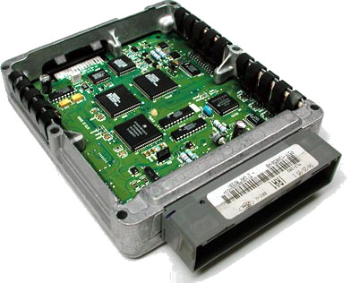
The automobile was invented in the industrial age – an age defined by energy, force, mechanics, chemistry, electricity, and physicality.

We are  now fumbling through the information age.

Apple Inc. has managed to reduce the thickness of laptop computers – they have become so thin that you can cut steak with them. But it should come as no surprise that the surface areas of laptop screens and keyboards have not been reduced, compared to the degree that computer chips have been miniaturized. There is a simple reason for this: human eyes and hands are still the same size. This will never change.

The same applies to communication. The more digital our machines become, the more we have to communicate with them, and they, in turn, have to communicate with us.

Screen Shot 2018-08-10 at 2.15.32 PM.png
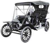
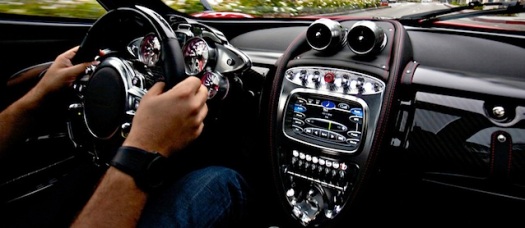
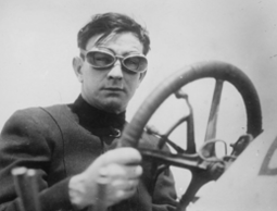
An old-fashioned industrial-age car comes with natural affordances: communication happens simply as a result of the physical nature of knobs, wheels, wires, engine sounds, torques, and forces. There are many sensory stimuli that the driver sees, feels, hears and smells – and often they are unconscious to the driver – or just above the level of consciousness.

Driving is a very different experience now. It is turning into a video game…a simulation. There is a disconnect between driver and car that seems to be growing wider.

That’s not necessarily a bad thing. But here’s the problem:

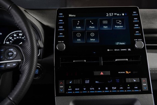
Body language between driver and car has become an arbitrary plaything, mediated by cockeyed displays and confusing controls. It is up to the whims of user interface designers – too many of whom have their heads up their asses. Idiots who call themselves designers live under the illusion that they can invent visual language on the fly and shove it into our long-lived lives, expecting their clever interfaces to fall naturally into use.

Or maybe they don’t actually think this – but don’t care anyway, because they are paid well. I’m not sure which is worse.

IZJA7NAP2JDJXMBG7PIVH5RVA4.jpg

According to Matt Bubbers:

There’s nothing wrong with the volume knob. It does not need reinvention, nor disruption, nor innovation. The volume knob is perfect the way it is. Or, rather, the way it was.

Get into a new car in 2018 and you’re faced with a multitude of complicated ways to adjust the stereo volume: buttons or dials on the steering wheel, voice commands that rarely work, fiddly non-buttons on the centre panel, touchscreens that take your eyes off the road, even gesture controls that make you wave your hand as if you’re conducting a symphony.

Cars are too complicated. The volume knob is indicative of the problem. Call it feature bloat or mission creep: Cars are trying to do more, but they’re not doing it all well. These infotainment features can be distracting, therefore dangerous, and they cost money.

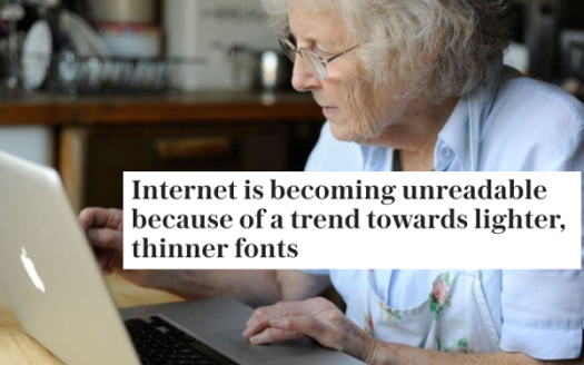
A new generation of digital designer is out of touch with nature. It is infuriating, because here we are, fumbling to bake a cake, turn on the AC, or change a channel on the TV: “Now, which of these 2,458 buttons on this TV remote do I need to press in order to change the channel?…”

“Oh shit – no wonder I’m confused: this is the remote control for the gas fireplace! Is that why it’s so hot in here?”

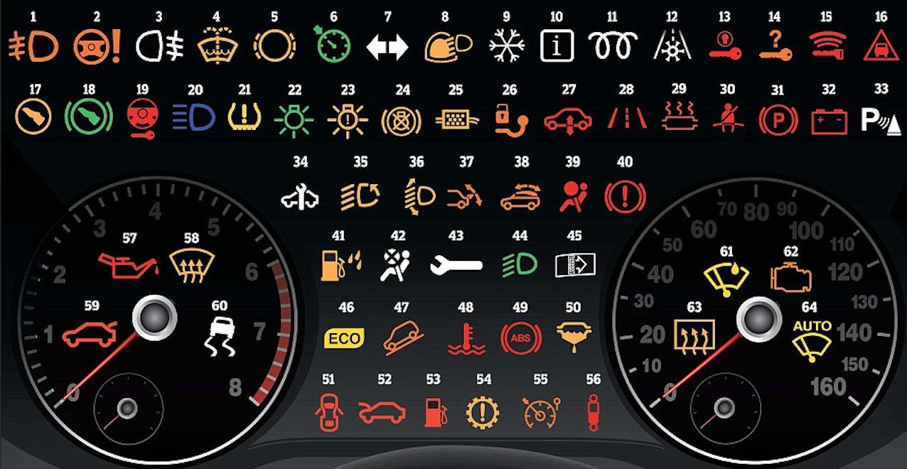
Driving under the influence of icons

Britania Rescue, a firm providing a breakdown service in England, conducted a survey, interviewing over 2000 drivers. The revelations are quite startling. It revealed that more than 52 per cent of drivers cannot correctly identify 16 of the most common symbols.

IMG_1207.JPG

Interpreting a bunch of unfamiliar icons invented by out-of-touch dweebs is not how we should be interacting with our technology – especially as technology sinks deeper into our lives.

Just this morning, my 87-year-old mother and I spent about a half-hour trying to figure out how to set my sister’s high-tech oven to bake. To make matters worse, my mother, who is visually-impaired, can’t even feel the controls – the entire interface consists of a dim visual glow behind slick glass. We eventually had to read a manual. WE HAD TO READ A FUCKING MANUAL TO FIGURE OUT HOW TO TURN ON AN OVEN. How long must this insanity go on?

A car’s manual should be the car itself

100212-biz-bmwshifter-hmed-8a.grid-6x2.jpg

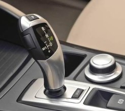
Dan Carney, in the article, Complex car controls equal confused drivers, quotes Consumer Reports:  “You shouldn’t have to read the owner’s manual to figure out how to use the shifter.”

He says, “The BMW iDrive had a controller for functions like the radio and air conditioning that was so baffling that it forced drivers to take their eyes off the road.”

My Prius experience

services.edmunds-media.jpg
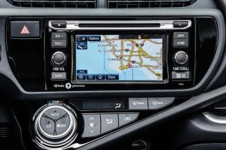
My first experience with a Prius was not pleasant. Now, I am not expecting many of you to agree with my criticism, and I know that there are many happy Prius owners, who claim that you can just ignore the geeky stuff if you don’t like it.

I don’t like it, and I can’t ignore it.

I have found that most people have a higher tolerance for figuring-out technology than I. It’s not for lack intelligence or education; it’s more that I am impatient with stupid design. It makes me irate, because these fumblings are entirely unnecessary.

We all suffer because of the whims of irresponsible designers, supposedly working in teams which include human factors engineers and ergonomics engineers, whom I assume are asleep on the job.

I place the blame for my impatience squarely on Donald Norman, whose book, “The Design of Everyday Things” implored readers to stop blaming themselves for their constant fumbling with technology. The source of the problem is irresponsible design. He converted me profoundly. And now I am a tech curmudgeon. Thanks Don.

I once had to borrow a friend’s Prius because my Honda Fit was in the shop. I liked the energy-saving aspects and the overall comfort, but the dashboard was unfamiliar. My hippocampi threw up their hands in despair. What’s worse: after parking the car in a parking lot, I put the key in my pocket and decided to check the doors to make sure they were locked. The doors were not locking. Why? I tried locking the doors many times but every time I walked around to the other side, the opposite door would unlock. I called the owner, and told her that I am not able to lock the car. She said, “Oh – that’s because the doors automatically – and magically – unlock when you walk up to them. Smart, eh?”

Hello? Discoverability? 

Thank you Prius for not telling me about your clever trick. You are one step ahead of me! Perhaps I should just stop trying to understand what the fuck you are doing and just bow to your vast intelligence. You win, Prius.

My Honda Fit is relatively simple, compared to many cars these days. But it does things that infuriate me. It decides that I want the back window wipers to turn on when the front wipers are on, and I happen to be backing up. It took my car mechanic to explain the non-brilliance of this behavior. Thanks Honda for taking away my choice in the matter. My car also decides to turn on the interior light at night after I have parked the car. I have to wait a long time for the light to go out. My car knows how long. I am not privy to this duration. What if I don’t want strangers to see me – because I’d like to finish picking my nose before getting out?

Whether or not strangers can see me picking my nose is no longer my choice. My car has made this decision for me. Sure: I could reach up to the ceiling and turn off the light – but then I will forget to turn it on again when I actually need it. This never used to be so complicated.
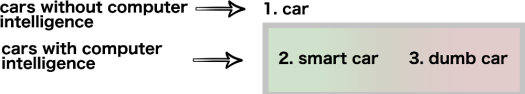
Smart = dumb

I have come to the conclusion that a car without any computers is neither smart nor dumb. It has no brain and so it cannot even try to be intelligent. On the other hand, if a car has computational processing then it has an opportunity to be either smart or dumb. Most cars these days are poor communicators, I call them dumb.

The decider

Another gripe: sometimes my door locks when I’m driving, and then I have to unlock it to get out – but not always. There is no rhyme or reason (that I am aware of) for when and why this happens. Yes…I know – some of you will probably offer to enlighten me with a comment. But the fact that this has to be learned in the first place is what bugs me. I would prefer one of two things: (1) My car makes it apparent to me why it is making decisions for me, or (2) it stays out of the way and lets me be the decision-maker.

Am I old-fashioned? If wanting to be in charge of basic things like locking doors and turning on lights makes me old-fashioned, then…yes, I’m old-fashioned.

The-Hog-Ring-Auto-Upholstery-Community-Complex-Dashboard.jpg

(image from http://www.thehogring.com/2013/07/31/10-most-ridiculous-dashboards-of-all-time/

Confessions of a MIT luddite

People confuse me for a techy because of my degree. And then they are shocked at how critical I am of technology. The truth is that I am a design nerd rather than a computer nerd. I have nothing against information technology – after all, I write software – and love it. I just want the technology that I rely on to be better at communicating. For example: why do gas pumps still have a one-word vocabulary? ….

Beep.

Okay, I’m a neo-luddite. There, I said it. And I will remain a neo-luddite as long as the tech industry continues to ignore a billion years of evolution, which gave us – and the rest of the living world – the means to generate signals and interpret signals – the body language of the biosphere that keeps the living world buzzing along.

This natural flow of communication among organisms is a wonderful thing to behold. It happens on a level of sophistication that makes ovens and VCR’s look like retardation in a box.

1_30x7H4l8REa9KXr2UEWyOw.jpg

But then again, the evolution of information technology is extremely short compared to the evolution of natural language, which has kept the social ecosystems of Homo Sapiens running for a very long time.

Perhaps I am thrashing in the midst of the Singularity, and I should just give up – because that’s what you do in the Singularity.

But I would still like to understand what the future of communication will look like. This is especially important as more and more communication is done between people and machines. At the moment, I am still a little hesitant to call it “communication”.

Anorexic Typeface Syndrome

As a design thinker of the Don Norman ilk, I place ample blame for human error on negligent or arrogant design from trend-setters who seem to be more intent on presenting slick, featureless interfaces than providing the natural affordances expected by human eyes, brains, and hands. Take typefaces for instance.

As the pixel resolution of our computer displays becomes higher, the arrogant designers who get hired by trend-setting corporations find it necessary to choose typefaces that are as thin as possible, because…thin is in!

Well, I have something to say about that: Anorexia Kills!

How about people’s ability to fucking read? I kind of like it when I can read. And I don’t like it when I am made to feel like an 87 year-old who needs a magnifying glass (like my mother – who is especially challenged when she has to actually read words on an iPad).

And it’s not just the rapidograph-like spiderweb of fonts that are becoming so hard to read. Designers are now fucking with contrast:

“There’s a widespread movement in design circles to reduce the contrast between text and background, making type harder to read. Apple is guilty. Google is, too. So is Twitter.”

—Kevin Marks WIRED: https://www.wired.com/2016/10/how-the-web-became-unreadable/

Sarah Knapton: https://www.telegraph.co.uk/science/2016/10/23/internet-is-becoming-unreadable-because-of-a-trend-towards-light/

I was in Boulder, looking for the Apple store so I could by a new MacBook Pro. I had a hard time finding the store because the symbol I was looking for was barely visible from a distance, or unless I was looking straight at it.

Apple is becoming less interested in helping us be productive than they are in being the most slick designed thing in the room – or the mall. Apple originally earned a reputation for good user-interface design. But the capitalist engine of unlimited growth and the subsequent need to differentiate among the competition has created a pathology. It has created a race to the bottom. At that bottom…our senses are being starved.

I have similar thoughts on the way physical Apple products have become so thin as to be almost dangerous – in this blog post.

It may be my imagination, but since buying my new MacBook, this very blog post seems harder to read. Did WordPress go on a font diet? Or is Apple the culprit? Check out this screenshot of this blog post as I am seeing it on my MacBook:

You may have heard the saying: “good design should be invisible”.

“Design should help people and be a silent ambassador to your business. Good designs are those that go unnoticed, that are experienced, that are invisible; bad designs are everywhere and stand out like a sore thumb.”

To say that good design should be invisible does not mean eliminating as many features as possible from a visual interface – causing it to become a wisp of gossamer that requires squinting. The human senses naturally rely on signals – we are accustomed to a high rate and high density of signals from our workable environments.

Okay, the trend away from serif to sans serif was reasonable. But I have a request of Apple and other design trend-setters: please stop eroding away at what few features remain.

Anorexia Kills!

The Miracle of My Hippocampus – and other Situated Mental Organs

I’m not very good at organizing.

pilesThe pile of papers, files, receipts, and other stuff and shit accumulating on my desk at home has grown to huge proportions. So today I decided to put it all into several boxes and bring it to the co-working space – where I could spend the afternoon going through it and pulling the items apart. I’m in the middle of doing that now. Here’s a picture of my progress. I’m feeling fairly productive, actually.

10457290-Six-different-piles-of-various-types-of-nuts-used-in-the-making-of-mixed-nuts--Stock-PhotoSome items go into the trash bin; some go to recycling; most of them get separated into piles where they will be stashed away into a file cabinet after I get home. At the moment, I have a substantial number of mini-piles. These accumulate as I sift through the boxes and decide where to put the items.

Here’s the amazing thing: when I pull an item out of the box, say, a bill from Verizon, I am supposed to put that bill onto the Verizon pile, along with the other Verizon bills that I have pulled out. When this happens, my eye and mind automatically gravitate towards the area on the table where I have been putting the Verizon bills. I’m not entirely conscious of this gravitation to that area.

Gravity Fields in my Brain

What causes this gravitation? What is happening in my brain that causes me to look over to that area of the table? It seems that my brain is building a spatial map of categories for the various things I’m pulling out of the box. I am not aware of it, and this is amazing to me – I just instinctively look over to the area on the table with the pile of Verizon bills, and…et voilà – there it is.

Other things happen too. As this map takes shape in my mind (and on the table), priorities line up in my subconscious. New connections get made and old connects get revived. Rummaging through this box has a therapeutic effect.

The fact that my eye and mind know where to look on the table is really not such a miracle, actually. It’s just my brain doing its job. The brain has many maps – spatial, temporal, etc. – that help connect and organize domains of information. One part of the brain – the hippocampus – is associated with spatial memory.

hippocampal-neurons_0-1

User Interface Design, The Brain, Space, and Time

I could easily collect numerous examples of software user interfaces that do a poor job of tapping the innate power of our spatial brains. These problematic user interfaces invoke the classic bouts of confusion, frustration, undiscoverability, and steep learning curves that we bitch about when comparing software interfaces.

This is why I am a strong proponent of Body Language (see my article about body language in web site design) as a paradigm for user interaction design. Similar to the body language that we produce naturally when we are communicating face-to-face, user interfaces should be designed with the understanding that information is communicated in space and in time (situated in the world). There is great benefit for designers to have some understanding of this aspect of natural language.

Okay, back to my pile of papers: I am fascinated with my unconscious ability to locate these piles as I sift through my stuff. It reminds me of why I like to use the fingers of my hand to “store” a handful of information pieces. I can recall these items later once they have been stored in my fingers (the thumb is usually saved for the most important item).

Body Maps, Brain, and Memory

inbodymaps

Screen Shot 2016-02-07 at 9.03.46 PMLast night I was walking with my friend Eddie (a fellow graduate of the MIT Media Lab, where the late Marvin Minsky taught). Eddie told me that he once heard Marvin telling people how he liked to remember the topics of an upcoming lecture: he would place the various topics onto his body parts.

…similar to the way the ancient Greeks learned to remember stuff.

During the lecture, Marvin would shift his focus to his left shoulder, his hand, his right index finger, etc., in order to recall various topics or concepts. Marvin was tapping the innate spatial organs in his brain to remember the key topics in his lecture.

My Extended BodyMap

18lta79g5tsytjpgMy body. My home town. My bed. My shoes. My wife. My community. The piles in my home office. These things in my life all occupy a place in the world. And these places are mapped in my brain to events that have happened in the past – or that happen on a regular basis. My brain is the product of countless generations of Darwinian iteration over billions of years.

All of this happened in space and time – in ecologies, animal communities, among collaborative workspaces.

Even the things that have no implicit place and time (as the many virtualized aspects of our lives on the internet)… even these things occupy a place and time in my mind.

Intelligence has a body. Information is situated.

Hail to Thee Oh Hippocampus. And all the venerated bodymaps. For you keep our flitting minds tethered to the world.

You offer guidance to bewildered designers – who seek the way – the way that has been forged over billions of years of intertwingled DNA formation…resulting in our spatially and temporally-situated brains.

treblebird

bodymapping.com.au

We must not let the no-place, no-time, any-place, any-time quality of the internet deplete us of our natural spacetime mapping abilities. In the future, this might be seen as one of the greatest challenges of our current digital age.

Hippocampus_and_seahorse_cropped

Failure and Recovery – an Important Concept in Design..and Life

I have observed that good design takes into consideration two important aspects of use:

  1. Failure Rate
  2. Recovery Rate

Well-designed products or software interfaces have low failure rates and low failure amounts. This is related to the concept of fault tolerance. A well-designed product or interface should not fail easily, and failure should not be complete.

“If its operating quality decreases at all, the decrease is proportional to the severity of the failure, as compared to a naively designed system in which even a small failure can cause total breakdown.”

A well-designed product or interface should also be easy to recover from failure.

81oCqPfe5wL._SX522_I recently bought a set of headphones. These were good headphones in most respects…until they broke at the complicated juncture where the ear pieces rotate. Once these headphones broke, there was really nothing I could do to fix them. But I decided to try – using a special putty that dries and holds things into place.


photo
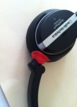
It took a long time to figure out how to do this. When I finally repaired the broken part, I realized that the wires had been severed inside. There was no sound coming through. I had no choice but to put them into the garbage bin where they will contribute to the growing trash heap of humanity. Bad design is not just bad for consumers: it’s bad for the planet.

While most people (including myself) would claim that Audio Technica headphones are generally well-designed, we are usually not taking into account what happens when they break.

13687716887463pSometimes the breakdown is cognitive in nature. There’s a Keurig coffee machine at work. It uses visual symbols to tell the user what to do.

As I have pointed out in another article, visual languages are only useful to the extent that the user knows the language. And designers who use visual language need to understand that natural language includes how something behaves, and shows its internal states, not just what kinds of icons is displays on its surface.

The Keurig coffee machine is a nice specimen in many respects. But I had discovered that if I apply the necessary actions in the wrong order, it fails. Namely: if I add the little coffee supply and press down the top part before the water has finished heating up, it doesn’t allow me to brew the coffee.

So…after the water finished heating up, I saw the buttons light up. “Cool” – I said.

But nothing happened when I pressed a button to dispense the coffee. “WTF” – I said. Then I decided to open up the lid and close it again. That did the trick. The lights started blinking. But I was not satisfied with the solution. The discoverability of this bit of behavioral body language ranks low on my list.

Hint: “Blinking Lights” Means “You Can Press a Button”

I have to say, though: I have experienced worse examples of undiscoverability with appliances – especially appliances that are so simple, sleek, and elegant that they have no body language to speak of. This infuriates me to no end. It is not unlike the people I meet on occasion who exhibit almost no body language. It makes me squirm. I want to run away.

Now, thanks to YouTube and the interwebs in general, there are plenty of people who can help us get around these problems…such as this guy who has a solution to a related blinking light problem:

Screen Shot 2016-01-31 at 12.04.09 PM

I realize there are not many people who are bringing up this seemingly small problem. But I bring it up because it is just one of many examples of poor affordance in industrial design that are so small as to be imperceptible to the average user. However, the aggregate of these small imperceptible stumbles that occur throughout our lives constitutes a lowering of the quality of life. And they dull our sense of what good design should be about.

Tiny Rapid Failures and Tiny Rapid Recoveries

148159580_GeneralBicycleNow consider what happens when you ride a bicycle. When riding a bike, you may occasionally lose balance. But that balance can easily be recovered my shifting your weight, turning the wheel, or several other actions – many of which are unconscious to you.

Think of riding a bike as a high-rate of tiny failures with a high-rate of tiny recoveries.

Taken to the extreme: a bird who is standing on one leg has neuromuscular controls that are correcting the balance of the bird’s center of gravity at such a high rate and in such tiny amounts, that we don’t even notice it (and neither does the bird).

flamingo-on-one-leg

Natural Affordance: Perceived Signifiers

User interfaces (in computer software as well as in appliances) should use natural affordances whenever possible so that users can make a good guess as to whether something is about to fail, whether it is failing, how much it is failing, and how to recover.

The best design allows for rapid, and often unconscious correction while using the product. Good design is invisible!

Donald Norman brought some of these ideas to the fore when he wrote the Design of Everyday Things. We still have a lot to learn from his teachings.

Design is a way of life. If you design your life with resilience in mind – with the ability to recognize failures before they happen, and with the ability to recover from those failures, you will live a better life. The same goes for designing the technology that increasingly fills our lives.

IS “ARTIFICIAL LIFE GAME” AN OXYMORON?

(This is a re-posting from Self Animated Systems)

langtonca

Artificial Life (Alife) began with a colorful collection of biologists, robot engineers, computer scientists, artists, and philosophers. It is a cross-disciplinary field, although many believe that biologists have gotten the upper-hand on the agendas of Alife. This highly-nuanced debate is alluded to in this article.

Games

What better way to get a feel for the magical phenomenon of life than through simulation games! (You might argue that spending time in nature is the best way to get a feel for life; I would suggest that a combination of time with nature and time with well-crafted simulations is a great way to get deep intuition. And I would also recommend reading great books like The Ancestor’s Tale :)

Simulation games can help build intuition on subjects like adaptation, evolution, symbiosis, inheritance, swarming behavior, food chains….the list goes on.

Screen Shot 2014-10-17 at 7.48.02 PMScreen Shot 2014-10-19 at 12.24.54 PMOn the more abstract end of the spectrum are simulation-like interactive experiences involving semi-autonomous visual stuff (or sound) that generates novelty. Kinetic art that you can touch, influence, and witness lifelike dynamics can be more than just aesthetic and intellectually stimulating.

These interactive experiences can also build intuition and insight about the underlying forces of nature that come together to oppose the direction of entropy (that ever-present tendency for things in the universe to decay).

Screen Shot 2014-10-17 at 7.58.33 PM

On the less-abstract end of the spectrum, we have virtual pets and avatars (a subject I discussed in a keynote at VISIGRAPP).

“Hierarchy Hinders” –  Lesson from Spore

Screen Shot 2014-10-17 at 8.18.59 PMWill Wright, the designer of Spore, is a celebrated simulation-style game designer who introduced many Alife concepts in the “Sim” series of games. Many of us worried that his epicSpore would encounter some challenges, considering that Maxis had been acquired by Electronic Arts. The Sims was quite successful, but Spore fell short of expectations. Turns out there is a huge difference between building a digital dollhouse game and building a game about evolving lifeforms.

Also, mega-game corporations have their share of social hierarchy, with well-paid executives at the top and sweat shop animators and code monkeys at the bottom. Hierarchy (of any kind) is generally not friendly to artificial life.

For blockbuster games, there are expectations of reliable, somewhat repeatable behavior, highly-crafted game levels, player challenges, scoring, etc. Managing expectations for artificial life-based games is problematic. It’s also hard to market a game which is essentially a bunch of game-mechanics rolled into one. Each sub-game features a different “level of emergence” (see the graph below for reference). Spore presents several slices of emergent reality, with significant gaps in-between. Spore may have also suffered partly due to overhyped marketing.

Artificial Life is naturally and inherently unpredictable. It is close cousins with chaos theory, fractals, emergence, and uh…life itself.

Emergence

alife graphAt the right is a graph I drew which shows how an Alife simulation (or any emergent system) creates novelty, creativity, adaptation, and emergent behavior. This emergence grows out of the base level inputs into the system. At the bottom are atoms, molecules, and bio-chemistry. Simulated protein-folding for discovering new drugs might be an example of a simulation that explores the space of possibilities and essentially pushes up to a higher level (protein-folding creates the 3-dimensional structure that makes complex life possible).

The middle level might represent some evolutionary simulation whereby new populations emerge that find a novel way to survive within a fitness landscape. On the higher level, we might place artificial intelligence, where basic rules of language, logic, perception, and internal modeling of the world might produce intelligent behavior.

In all cases, there is some level of emergence that takes the simulation to a higher level. The more emergence, the more the simulation is able to exhibit behaviors on the higher level. What is the best level of reality to create an artificial life game? And how much emergence is needed for it to be truly considered “artificial life”?

Out Of Control

Can a mega-corporation like Electronic Arts give birth to a truly open-ended artificial life game? Alife is all about emergence. An Alife engineer or artist expects the unexpected. Surprise equals success. And the more unexpected, the better. Surprise, emergent novelty, and the unexpected – these are not easy things to manage…or to build a brand around – at least not in the traditional way.

Screen Shot 2014-10-17 at 9.04.07 PMMaybe the best way to make an artificial life game is to spread the primordial soup out into the world, and allow “crowdsourced evolution” of emergent lifeforms.  OpenWorm comes to mind as a creative use of crowdsourcing.

What if we replaced traditional marketing with something that grows organically within the culture of users? What if, in addition to planting the seeds of evolvable creatures, we also planted the seeds of an emergent culture of users? This is not an unfamiliar kind problem to many internet startups.

Are you a fan of artificial life-based games? God games? Simulations for emergence? What is your opinion of Spore, and the Sims games that preceded it?

This is a subject that I have personally been interested in for my entire career. I think there are still unanswered questions. And I also think that there is a new genre of artificial game that is just waiting to be invented…

…or evolved in the wild.

Onward and Upward.

-Jeffrey

The Unicorn Myth

I was recently called a “unicorn” – a term being bantered around to describe people who have multiple skills.

Unicorn-Vomit-Puke-E-Liquid-E-Juice-Vapor-Geekz-Vape-E-Cig-660x822


Here’s a quote from http://unicornspeakeasy.com/

“Dear outsiders,

Silicon Valley calls us unicorns because they doubt the [successful, rigorous] existence of such a multidisciplinary artist-engineer, or designer-programmer, when in fact, we have always been here, we are excellent at practicing “both disciplines” in spite of the jack-of-all-trades myth, and oh yeah – we disagree with you that it’s 2 separate disciplines. Unicorns are influential innovators in ways industries at large cannot fathom. In a corporate labor division where Release Engineer is a separate role from Software Requirements Engineer, and Icon Designer is a separate role from Information Architect, unicorn disbelief is perfectly understandable. To further complicate things, many self-titled unicorns are actually just programmers with a photoshop habit, or designers who dabble with Processing. Know the difference.”

Here’s David Cole on the “The Myth of the Myth of the Unicorn Designer“. He says:

“Design is already not a single skill.”

always_be_yourself_unless_you_can_be_a_unicorn_tshirt-r0a27d5bc26b7444f9233c46d012f5e3d_vj7bv_512

There are valid arguments on either side of the debate as to whether designers should be able to code. What do you think?

-Jeffrey

Programming Languages Need Nouns and Verbs

I created the following Grammar Lesson many years ago:

grammar lesson

Like many people my age, my first programming language was BASIC. Next I learned Pascal, which I found to be extremely expressive. Learning C was difficult, because it required me to be closer to the metal.

computer-memory-2
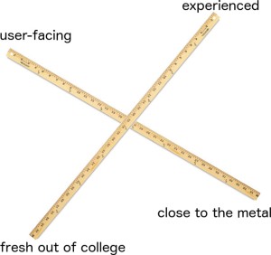
Graduating to C++ made a positive difference. Object-oriented programming affords ways to encapsulate the aspects of the code that are close to the metal, allowing one to ascend to higher levels of abstraction, and express the things that really matter (I realize many programmers would take issue with this – claiming that hardware matters a lot).

Having since learned Java, and then later…JavaScript, I have come to the opinion that the more like natural language I can make my code, the happier I am.

Opinions vary of course, and that’s a good thing. Many programmers don’t like verbosity. Opinions vary on strong vs. weak typed languages. The list goes on. It’s good to have different languages to accommodate differing work styles and technical needs.

But…

if you believe that artificial languages (i.e., programming languages) need to be organic, evolvable, plastic, adaptable, and expressive (like natural language, only precise and resistant to ambiguity and interpretation), what’s the right balance?

Should Programs Look Like Math? 

Should software programs be reduced to elegant, terse, math-like expressions, stripped of all fat and carbohydrates? Many math-happy coders would say yes. Some programmers prefer declarative languages over procedural languages. As you can probably guess, I prefer procedural languages.

Is software math or poetry? Is software machine or language?

I think it could – and should – be all of these.

Screen Shot 2015-01-31 at 6.04.00 PM

Sarah Mei has an opinion. She says that Programming is Not Math.

Programming with Nouns and Verbs

First: let me just make a request of all programmers out there. When you are trying to come up with a name for a function, PLEASE include a verb. Functions DO things. Like any other kind of language, your code will grow in a healthy way within the ecology of human communicators if you make it appropriately expressive.

Don’t believe me? Wait until you’ve lived through several companies and watched a codebase try to survive through three generations of developers. Poorly-communicating software, put into the wrong hands, can set off a pathological chain of events, ending in ultimate demise. Healthy communication keeps marriages and friendships from breaking down. The same is true of software.

Many have pontificated on the subject of software having nouns and verbs. For instance, Matt’s Blog promotes programming with nouns and verbs.

And according to John MacIntyre, “Take your requirements and circle all the nouns, those are your classes. Then underline all the adjectives, those are your properties. Then highlight all your verbs, those are your methods”.

When I read code, I unconsciously look for the verbs and nouns to understand it.

codefragment-thumb-300x268-258

When I can’t identify any nouns or verbs, when I can’t figure out “who” is doing “what” to “whom”, I become cranky, and prone to breaking things around me. Imagine having to read a novel where all the verbs look like nouns and all the nouns look like verbs. It would make you cranky, right?

The human brain is wired for nouns and verbs, and each is processed in a different cortical region.

fig

There are two entities in the universe that use software:

(1) Computers, and (2) Humans.

Computers run software. Human communicate with it.

mammalian-brain-computer-inside

-Jeffrey

Disappearing UI Elements – I Mean, WTF?

I recently noticed something while using software products by Google, Apple, and other trend-setters in user interface design. I’m talking about…

User interface elements that disappear

baby_peekabooI don’t know about you, but I am just tickled pink when I walk into the kitchen to look for the can opener, and can’t find it. (I could have sworn it was in THIS drawer. Or….maybe it was in THAT drawer?)

Sometimes I come BACK to the previous drawer, and see it right under my nose…it is as if an invisible prankster were playing tricks on me.

Oh how it makes me giggle like a baby who is playing peekaboo with mommy.

An open male hand, isolated on a white background.

Not really. I lied. It makes me irrational. It makes me crazy. It makes me want to dismember kittens.

Introducing: Apple’s New Disappearing Scrollbar!

scrollbar-exhibit-300x226

According to DeSantis Briendel, “A clean and uncluttered visual experience is a laudable goal, but not at the expense of an intuitive and useful interface tool. Making a user hunt around for a hidden navigation element doesn’t seem very user friendly to us. We hope developers will pull back from the disappearing scrollbar brink, and save this humble but useful tool.”

It gets worse. If you have ever had to endure the process of customizing a YouTube channel, you may have discovered that the button to edit your channel is invisible until you move your mouse cursor over it.

maxresdefault

invisible

I observed much gnashing of teeth on the internet about this issue.

One frustrated user on the Google Product Forums was looking for the gear icon in hopes to find a way to edit his channel. To his remark that there is no gear icon, another user joked…

“That is because “the team” is changing the layout and operation of the site faster than most people change underwear.”

…which is a problem that I brought up in a previous blog about the arbitrariness of modern user interfaces.

There are those who love bringing up Minority Report – and claim that user interfaces will eventually go away, allowing us to just wave our hands in the air and speak naturally, and to communicate with gestures in thin air.

Bore hole

In Disappearing UI: You Are the Interface, the author describes (in utopian prose) a rosy future where interfaces will disappear, liberating us to interact with software naturally.

But what is “natural”?

What is natural for the human eye, brain, and hand is to see, feel, and hear the things that we want to interact with, to physically interact with them, and then to see, feel, and hear the results of that interaction. Because of physics and human nature, I don’t see this ever changing.

OK, sure. John Maeda’s first rule for simplicity is to REDUCE.

But, by “reduce”, I don’t think he meant…

play hide and seek with the edit button or make the scroll bar disappear while no one is looking.

Perhaps one reason Apple is playing the disappearing scroll bar trick is that they want us to start doing their two-finger swipe. That would be ok if everyone had already given up their mice. Not so fast, Apple!

Perhaps Apple and Google are slowly and gradually preparing us for a world where interfaces will dissolve away completely, eventually disappearing altogether, allowing us to be one with their software.

Seems to me that a few billions years of evolution should have some sway over how we prefer to interact with objects and information in the world.

I like to see and feel the knife peeling the skin off a potato. It’s not just aesthetics: it’s information.

I like seeing a person’s eyes when I’m talking to them. I like seeing the doorknobs in the room. I like knowing where the light switch is.

yy

Apple, please stop playing hide-and-seek with my scroll bar.

-Jeffrey

Bucky Fuller, Where are You? (On the Boxiness of Corporate Employment)

Bucky

“Okay, but…if you had to choose between calling yourself a designer or calling yourself an engineer, which would you choose?”

boxes

Specialists and Generalists

I have often needed a specialist to do a specific task for me. This is normal. Specialists have a role in the economy and one could argue (along with Adam Smith) that specialization is the very basis of economy.

But too much specialization comes at a cost to innovative tech companies…and to creative individuals. Especially now, and increasingly – into the future…

Here’s an article in the Harvard Business Review on that topic:

Screen Shot 2014-11-02 at 10.43.34 PM

Nourishing My Inner Bucky

Interviewers have often asked me how I rank myself in terms of software engineering skill. As if there were a one-dimensional yardstick upon which all engineers can place themselves.

When one is evaluated with a one-dimensional yardstick, one usually ends up with a low grade.

For the same reason that there are multiple dimensions to intelligence, why not use more than one yardstick to evaluate an engineer?

url

The space that lies between all these one-dimensional yardsticks yields great connective knowledge. This is the domain of the COMPREHENSIVIST.

I lament the boxiness of the standard company recruiting process – even within companies that claim to employ people who think outside the box (like Google). Here’s a Google employee admitting to their deplorable interview process); “Pablo writes that his best skill is product design, but that his Google recruiters only showed interest in his ability to code.”

Screen Shot 2014-11-02 at 9.17.30 PMWe hear of how generalists and right-brain thinkers are in such demand these days.

Bullshit. When it comes to finding employment in companies, we are still confronted with an array of boxes, and we are still expected to show how well we fit into (one) of them. Consider Linked-In.

linkedinMy Linked-In profile has the following as my “industry”:

SHIPBUILDING

Why did I choose Shipbuilding? LinkedIn REQUIRES that I choose ONLY ONE of the industries from its list, and it DOES NOT allow me to choose more than one industry. Shipbuilding was the furthest thing I could find from what I do. Instead of trying to use a single box to characterize myself, I prefer to go in the opposite direction.

Linked-In = Boxed-In

Now I want to say a few things about being an older person who has faced difficulty fitting into the workforce.

We Are All Multi-Dimensional – Increasingly as we Age

Experienced (i.e., older) programmer/innovator/designers should be contributing more of those intangibles to the tech industry that Google is so bad at seeking out.

The tech industry has a fundamental problem: software plays an increasing role in people’s lives. The world’s population is aging. Young engineers who know the latest buzzwords of the last five years are hired quickly and eagerly. An aging population tries to keep up with fast-changing software interfaces. And more and more of this aging population consists of software engineers who have something the young programmers don’t have: wisdom, experience, perspective.

We are exactly what Silicon Valley needs.

Screen Shot 2014-11-02 at 9.01.40 PM

No one in particular is to blame for ageism in high-tech startups. The problem does not stem from any particular favoritism of young people: it is due to the short-sightedness of the tech industry, and the emphasis on the quick-thinking, risk-taking attributes associated with youth.

People who are professionally multi-dimensional should play a key role in human-centered software design. The cultural divide, identified by C. P. Snow in 1959, is still with us. Boxes breed boxes. That’s why we’re in the box we’re in.

-Jeffrey

We Need a Revolution in Software Interaction Design

restaurant-kitchen We need a revolution in software interaction design. Apple and Google will not provide it. They are too big. They are not the solution. They are the problem.

This revolution will probably come from some unsuspecting source, like the Maker Movement, or an independent group of people or company that is manufacturing physical goods. Here’s why: as computers increasingly inhabit physical objects, as the “internet of things” grows, as more and more computing makes its way into cars, clothing, and houses, there will come new modalities of interacting with software. And it will be dictated by properties of the physical things themselves. Not by the whims and follies of interface designers, whose entire universe consists of a rectangle of pixels and the touch of a user.

Let me explain what I mean when I say that software interaction design needs a major paradigm shift.

Affordance

I hate having to use the word “affordance”. It’s not a very attractive or colorful word. But it’s the best I’ve got. If you’ve read my other blogs posts or my book, Virtual Body Language, you have heard me use it before. The word was given higher currency in the user interface design world thanks to Donald Norman, whose book, The Design of EveryDay Things, I highly recommend. (He was forced to change the name from the “Psychology of Everyday things”. I like his original title better).

ava-coon-2Affordance, originally used in J.J. Gibson’s theory of ecological psychology, refers to the possible ways an animal or human can interact with an object (which can be another animal). We often use it in reference to the ways that one interprets visual, tactile and sonic features of a thing, be it an egg-beater, a frightened dog, or a new version of iMovie.

Sensory_Feedback_in_Brain_Computer_Interfaces1A “natural affordance” is a property that elicits an understanding or response that does not have to be learned  – it’s instinctual. In reference to industrial design: a knob affords twisting, and perhaps pushing, while a cord affords pulling. The term has more recently been used in relation to UI design to indicate the easy discoverability of possible actions.

UPDATE…

Bruce Tognazzini pointed out to me that Donald Norman has more recently been using the term “Perceived Signifier”. And this article explains some of the new semantic parsing going on regarding the word “affordance”. Personally, I would be happy if all of this got subsumed into the language of semiotics.

I believe we have WAY TOO MANY artificial affordances in our software interfaces. I will repeat the call of many wise and learned designers: we need to build tools with natural affordances in mind. Easier said than done, I realize. Consider a common modern interface, such as the typical drop-down dialog of the Apple that allows one to download a file:

dialog_2 As a general rule, I like to download files to my desktop instead of specifying the location using this dialog. Once a file is there, I then move it to the appropriate place. Even though it takes me a bit longer, I like the feeling of putting it there myself. My muscles and my brain prefer this.

Question: have you ever downloaded a file to a specific, somewhat obscure folder, and then later download another file, thinking it was to your desktop, and then not being able to find it? Well, you probably didn’t think to check the dialog box settings. You just hit SAVE, like you usually do, right? It’s automatic. You probably forgot that you had previously set the dialog box to that obscure, hard-to-remember folder, right? Files can get lost easily, right? Here’s the reason:

PESKIMO_Desks

Software files are abstract concepts. They have no physical location, no mass, no weight. All the properties that we associate with files are virtual. The computer interface is just a bundle of physical metaphors (primarily desktop metaphors) that provide us with affordances so we can think about them as if they were actual things with properties.

The dialog I showed you doesn’t visually express “in” in a natural way. The sensation of the action is not like putting a flower in a vase or drawing a dot in a circle.

Herein lies a fundamental problem of software interface and interaction design. Everything is entirely arbitrary. Natural laws do not apply.

Does the natural world present the same kind of problem as we have when we lose files? Sometimes, but not so often. That’s because the natural world is full of affordances. Our memories are decorated with sensations, associations, and connections, related to our actions. If I physically put a rubber band in an obscure bowl on the top shelf, I have reason to remember this action. Muscle-memory plays a major part in this. With downloading files on a computer, you may not know where you put the file. In fact, sometimes you can’t know!

In fact, it’s not fair to use the word “put”, since “putting” is a deliberate, conscious act. An accidental fumble on the keyboard can cause a keyboard shortcut command that deletes a file or opens up a new window. When this happens, the illusion breaks down completely: this is not a real desktop.

Am I getting too esoteric? Okay, I’ll get more down-to-earth and gritty…

My Deteriorating Relationship with Apple

Bruce Tognazzini says: “While Apple is doing a bang-up job of catering to buyers, they have a serious disconnect at the point at which the buyer becomes a user.” 

url
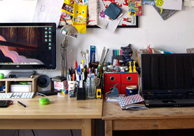
My recent experiences with Apple software interfaces have left me worse than disenchanted. I am angry. Apple has changed the interface and interaction of one too many of its products, causing my productivity in some applications (like iMovie) to come to a screeching halt.

At the end of the day, I’d rather keep my old computer with my trusty collection of tools than to have a shiny new, sexy, super-thin Macbook that replaces my trusty old tools. There are years of muscle memory that I have built up in learning and using these tools. My career depends on this muscle memory. When Apple changes these interactions with no clear reason, I become very angry. And so should all its customers.

And then…there is iTunes.

itunessync

Let’s not talk about iTunes.

Apple’s latest operating system disabled many of the interactions that I (and many others) have been using for decades.

One annoyed user said: “I wish Apple wouldn’t change the fundamental functions of the Finder like this. First, they reversed the scroll button directions then they changed the default double-click to open a folder in a new window function. I’m just glad that they don’t make cars otherwise we would have the brake and accelerator pedal functions reversed (with a pull on the wiper lever to revert to the original)!”

And from the same thread… “If a company cares about users, it doesn’t make a change just for the sake of change that wipes out thirty years of muscle memory.”

Am I saying that a company like Apple should never change its interfaces? Of course not. But when they do, they should do it carefully, for valid reasons, and gracefully. And they should ALWAYS give their customers the choice of if, when and how to adapt to these changes. Easier said than done, I know. Apple is like most other companies. They feel they have to constantly make NEW products. And that’s because our capitalist system emphasizes growth over sustainability.

Will the Maker Revolution Cure Us of Arbitrary, Ephemeral Design?

This is why I believe we need to return to natural affordances that are as intuitive as putting a spoon in a bowl or carving the bark off a stick. The more natural the affordance, the less arbitrary the design. Designers will have to be less cocky, more reverent to human nature and physical nature.

When real physical things start dictating how we interact with software, the playing field will be different. And software interaction designers will have to fully understand natural affordances, and design for them. That’s a revolution I can get behind.

.